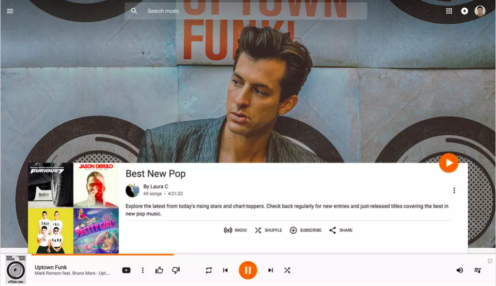
Google redesigns Play Music on the web with a bigger focus on artwork
 Small design tweaks result in Google’s service looking better than ever
By Chris Welch on May 14, 2015 01:00 pm
A few months ago, Google’s Play Music smartphone apps were updated to showcase the company’s colorful material design interface. And today, Google is giving a similar fresh coat of paint to Play Music on the web. Load the company’s music portal and you won’t notice any drastic differences from what was there yesterday, but a slew of design tweaks have brought Play Music into a more cohesive experience that feels more app than website — and that’s the whole point.
“We’re moving towards making the web feel more like an app and less like a series of web pages strung together by links,” said Google UX designer Bryan Rea by email. “The new header, the slick transition as you scroll, the collapsible nav, new animations, these all feel like things you expect in an app not on the web.” Aside from some updates to fonts and transitions, you’ll also notice a much greater emphasis on artwork. High-resolution photos fill the screen behind every playlist, album, and artist bio page. “For the increased focus on big, immersive artwork, when you’re listening to music, you can get lost in it (in a good way),” wrote Rea. “With the new album and playlist pages, you enter an immersive world focused on the music you’re enjoying.”
Read More: http://www.theverge.com/2015/5/14/8606255/google-play-music-web-redesign